April 26, 2018 —
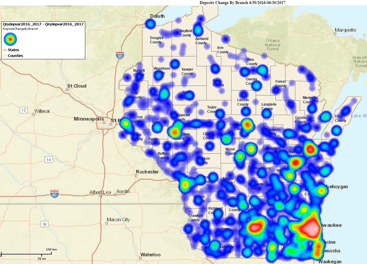
We heard you! You want more Banconomics Geospatial Analysis. So we’ve created a simple heat map highlighting the change of deposits in Wisconsin by bank branch from June 2016 to June 2017. With a quick glance, you’ll be able to determine which areas had the greatest amount of positive change.Red is indicative of the greatest amount of change while blue indicates the lower end of the spectrum. You can use the legend in the top left hand corner for reference.
Check it out!